
These guides are designed to walk you through the functionality of Gimmal Physical.
These guides reflect the most current version of the product. Please refer to the legacy documents section or contact support for assistance with older versions of the application.
Use the tree view on the left or the links below to find the appropriate article of interest.
-
Installation Guide -
Security Model Overview -
Technical Specifications – Cloud -
Technical Specifications – On-Premises -
Gimmal Physical REST Services Technical Guide -
Creating Resource Language Files -
Technical Specifications - Iron Mountain Connector -
Administration Page -
Gimmal Physical REST Services Technical Guide (4.2) -
SFTP Import Process Guide -
Role To Role Management -
Archive Application History -
Role Preferences -
Add, Update, or Remove List Values -
Broadcast Notifications Configuration -
Configuring a Notification -
Record Holds -
Carry Forward -
Application Configuration -
Configuring E-Signature -
How Gimmal Physical Determines if Records Match -
Report Level Security -
Supply Requests -
Application Tracking -
Data Security -
Creating New Security Roles -
Tab Filters -
Secured List Fields -
Administrative Functionality
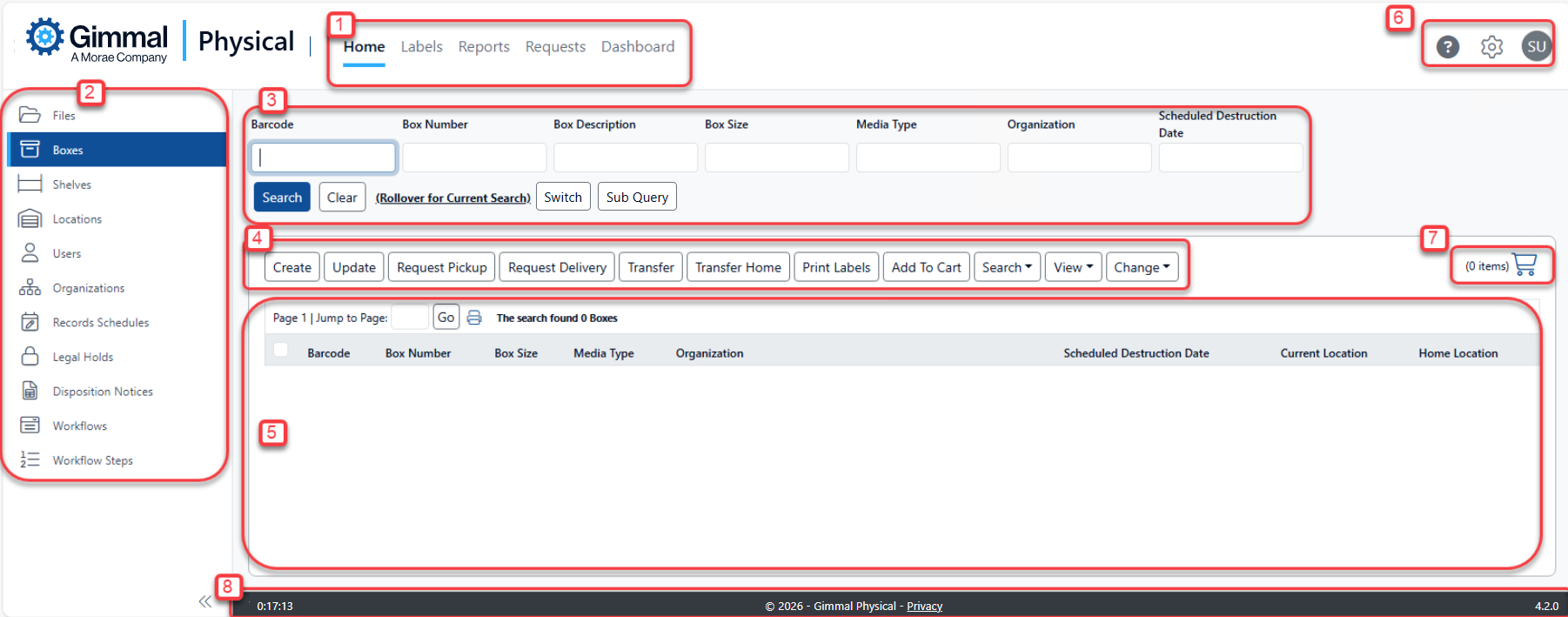
Home Page Overview
-
Navigation Ribbon – Provides access to the various indicated functions.
-
Data Tabs – Collapsible pane for accessing the different item types being tracked, both logical and physical. Also referred to as the Side Navigation or Left Navigation.
-
Quick Search – Frequently used fields for querying records within the selected tab.
-
Action Bar – Configurable actions available for each Data Tab. Actions available depends on the item type of the current Data Tab.
-
Home Page Grid – Displays search results and allows viewing data, and selection of items for bulk actions (requests, updates, etc.)
-
Help, Configuration, Logout -
-
Help icon - Clicking opens a browser tab to Gimmal Physical’s online documentation.
-
Gear icon - Used to access the application’s Preferences and Admin configuration pages.
-
User icon - Used to log out of the application.
-
-
Cart - Used to aggregate multiple items for Pickup and Delivery requests.
-
Session clock and application version.