
This topic has an interactive tutorial. To view this tutorial, click here.
Reminder
The actual field, tab, and action button names can be configured per organization and may vary from those shown in the examples.
Gimmal Physical is a highly configurable application that helps organizations of all sizes manage physical records to their specifications. Therefore, the screenshots and interface examples used throughout this guide may differ from the implementation used at your organization. However, the basic elements described below should be represented within your deployment.
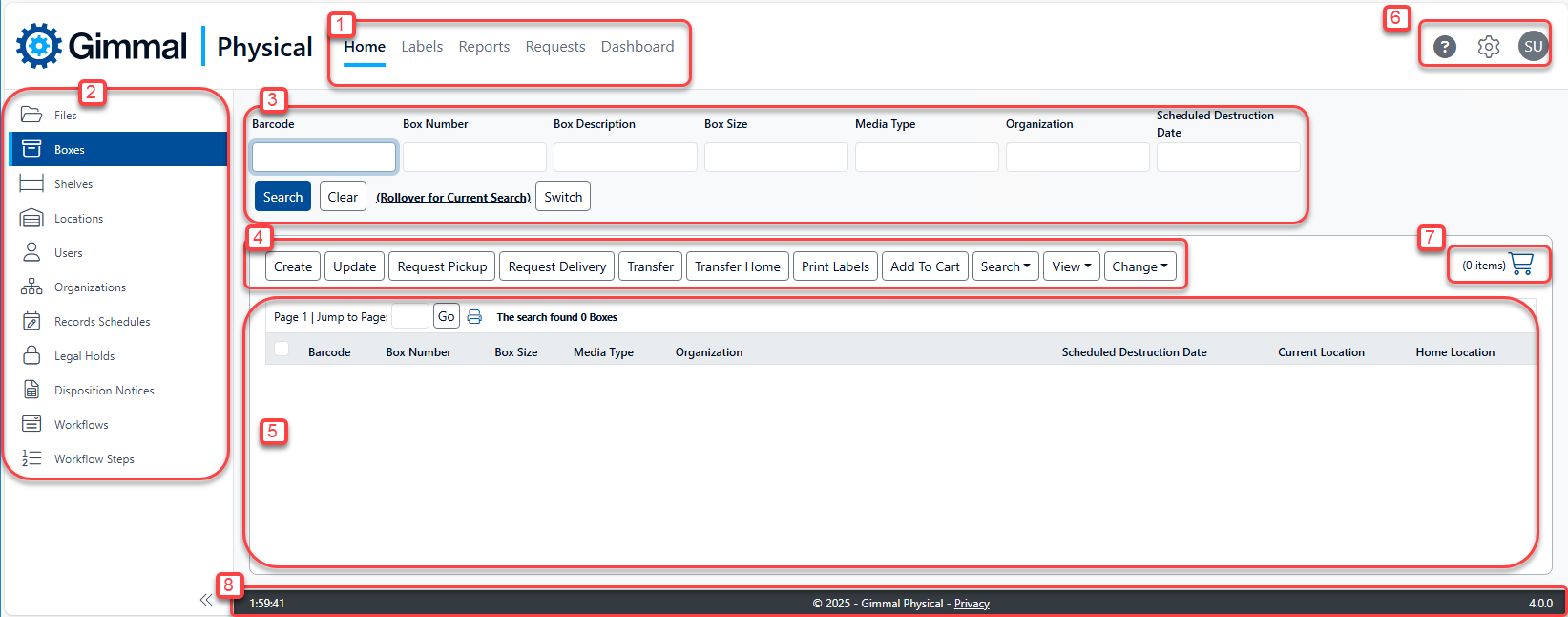
Default Interface
-
Navigation Ribbon – Provides access to the various indicated functions. Also called ‘Navigation Menu or Application Ribbon’.
-
Tabs Panel – Collapsible panel for accessing the different item types (individually called a Tab or Data Tab) being tracked, both logical and physical. Also referred to as the Left, or Side, Navigation panel or pane.
-
Quick Search – Frequently used fields for querying records within the selected tab.
-
Action Bar – Configurable actions available, Preferences, and Admin configuration pages.
-
Home Page Grid – Displays queried results and allows navigation and selection of items
-
Options Panel – Offers links to
-
Help - By default, this link displays Help information available on the Gimmal website, but it can be changed to a company-managed site listing Help content specific to your organization.
-
Gear - Contains a menu with settings-related options:
-
Preferences - Manages options affecting application display and behavior, and governing broader application functionality as well as those specific to each of the tabs. This is available to set on a user level or, with appropriate permissions, the application level.
-
Admin - Provides access to various administration settings for configuration and security-related options.
-
Print - Opens the browser print options for the current page
-
-
User account with logout actions
-
-
Shopping Cart - Used to aggregate multiple items for Pickup and Delivery requests.
-
Information Ribbon - Shows details such as session clock and application version.
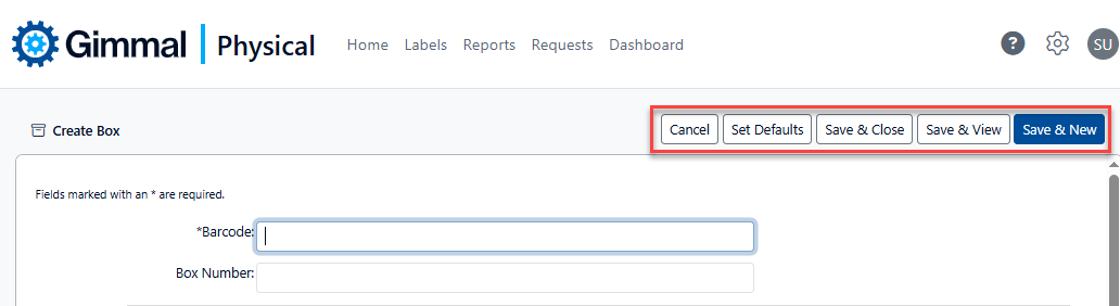
Standard Buttons
Data Creation or Update pages for the vast majority of item types have many useful buttons found at the top of the screen. Using 'Create Box’ as an example:
-
Cancel closes the form without saving any changes.
-
Set Defaults saves the currently entered values as defaults for any new record of the same type.
-
Save & Close will save all fields and close the form, returning to the home page.
-
Save & View will save all fields and go to the View page for the item.
-
Save & New will save all fields for this item and remain on the page to create a new item.
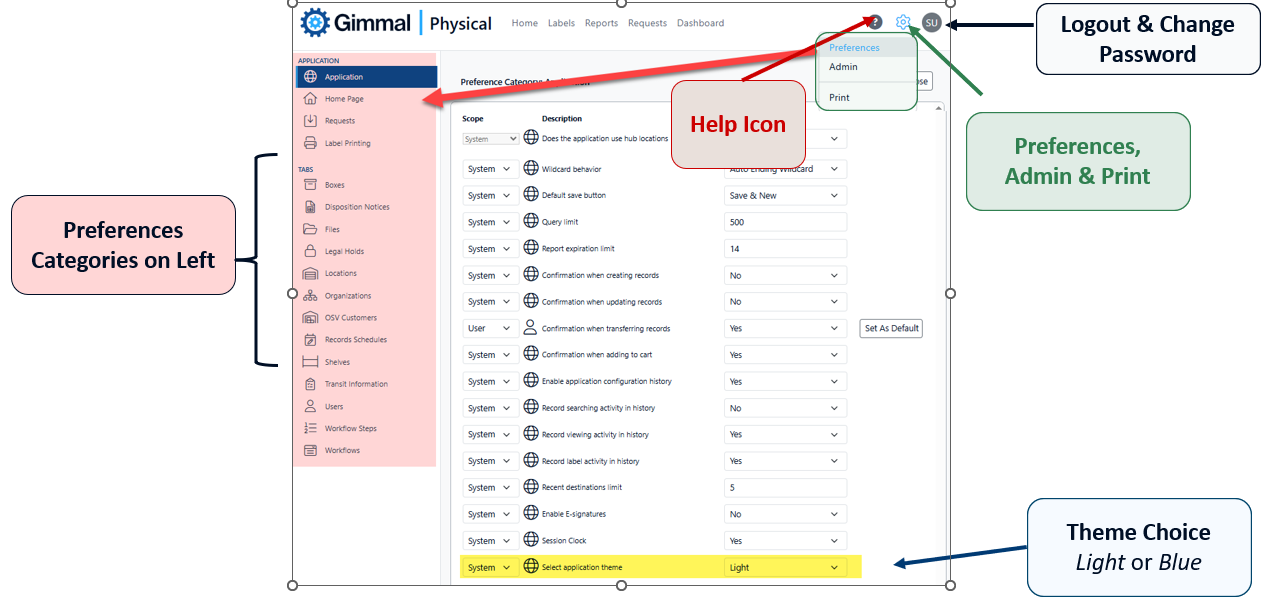
Interface Options
Some interface options can be set using the gear icon to set Preferences. In the Application tab, the choice of Light or Blue theme can change the look of the application on a user or system level (depending on permissions).
This guide uses the ‘Light’ theme for all screen captures.
Helpful Hints
-
When creating or updating data entry pages, fields with asterisks (*) are required.
-
Administrators have a large number of options for controlling field display, captions, and order. See the Admin | Field Display or Admin | Advanced Field Display pages to view and alter options.