
Drop Zone consists of two main configurable elements:
An image library, which the Drop Zone web part uses
-
The Drop Zone behavior, which is configured independently for the web part, and for the library drag-and-drop interface.
-
The first configurable element – the image library – comes pre-configured with two 800 pixels x 800 pixels .png image files, which you can use in the Drop Zone web part. Drop Zone accepts standard image file formats (e.g., .jpg, .png, .gif, .bmp).
The recommended configuration is to use the OOTB site groups (i.e., <SITE> Visitors/Members/Owners).
There is a workaround which may provide the experience you are looking for. Update the permissions for the following (possibly hidden) lists in your SharePoint site to allow Read for your custom SharePoint security group:
-
~/lists/GimmalLocalComponents
-
~/lists/GimmalLocalSettings
If you want to use different images for the Drop Zone web part(s), you can access them from the Drop Zone image library or from another location within the site. You are not required to store your images in the Drop Zone image library (link). If you store your images in another location in your site, you can specify that location in the Drop Zone Settings page (link).
The default location for the Drop Zone image library is in the Style Library/Drop Zone folder. Each Drop Zone site will have its own Drop Zone image library folder.
Drop Zone uses the Governance Hub to enable you to select the default image that displays on all Drop Zone web parts. The Governance Hub then pushes the default image setting down to the respective local sites (based on the component's installed locations). Each local site has a location in which Drop Zone images can be stored (in the Style Library/Drop Zone folder). Note that while the Governance Hub pushes down the default image, the image can still be changed on the local site.
The second configurable element – the Drop Zone behavior – provides end users with the desired upload experience. The Drop Zone behavior is configured differently, based on the type of integration you are using. See the following table for more information:
|
Integration Type |
Configuration Method |
|
Drop Zone web part |
Configure by adding and then editing the Drop Zone web part. "Design" permission required on the page item being edited. |
|
Library-based Drop Zone |
Configure by accessing the Library ribbon > Drop Zone Settings menu option. "Edit" permission required. |
|
Drop Zone with Gimmal's Document Center product |
Configure in two places, both available when editing the Document Center library tile: '
"Full Control" (i.e. Site Admin) permission required on the site. |
|
"Inline" Drop Zone |
Configure by editing a Drop Zone script, which searches for specific elements on the page and processes them just like regular Drop Zones. "Full Control" (i.e. Site Admin) permission required on the site. |
Functional Configuration Overview
As described in the previous section, you must independently configure each type of Drop Zone integration. The Drop Zone web part and a library-based Drop Zone remain inactive until you configure them with at least one content type profile for each Drop Zone, in addition to configuring the global settings for the web part (i.e., setting the default Drop Zone image).
When you create content type profiles specific to the selected content type, the system creates a tab named for the content type for each profile. The web part and the library-based Drop Zone have similar configurable elements except where otherwise noted. Refer to the next section to configure web parts and content type profiles.
Pre-Configuration Tasks: Drop Zone
Adding Drop Zone to a Host Site
Prior to configuring Drop Zone and using it in a site, you must add Drop Zone to a host site. Ensure that you have successfully deployed the app to the SharePoint App Catalog before continuing with these steps, and ensure that you install Drop Zone only in the root web of the host site.
Users in subsites will need access to the parent level site where Drop Zone is added for Drop Zone to work in subsites.
Microsoft does not allow you to use the System Account to add apps! Use a non-system account with appropriate permissions to perform these steps.
-
Navigate to the host site as a user who has "full control" permissions on the site collection to add the app.
-
Select Settings > Site Contents. The Site Contents page displays.
-
Select + add an app from the top of the page. A Drop Zone tile displays under Apps you can add.
-
Click the Drop Zone tile. A window displays: Do you trust Drop Zone?
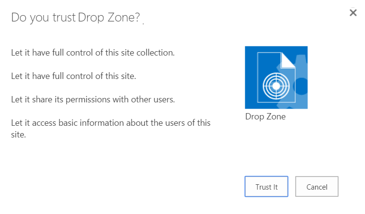
5. Click Trust It on the following screen. The page refreshes when the app is installed. Depending on your system, this can take several minutes.
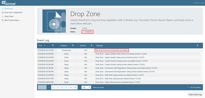
6. Click on the newly installed Drop Zone app tile to provision the app.

7. Ensure that the App Provisioned successfully message displays under Event Log, and the green checkmark displays next to Status. This could take several minutes.
8. Verify that the Drop Zone app displays on the Governance Hub Dashboard by following these steps:
-
Navigate to the site where Governance Hub is installed.
-
Select Settings > Site Settings to display the Site Settings page.
-
Under the Site Administration section, click Governance Hub. The Governance Hub Dashboard displays.
-
Verify the Drop Zone tile displays on this page.
Drop Zone Configuration
Before you configure Drop Zone, ensure that you have installed the Drop Zone app, completed the post-installation tasks, and have updated the Gimmal Job Scheduler files (if applicable). See the Content Governance for SharePoint installation section for information on these tasks.
When Drop Zone is configured to Approve on upload, and the user does not have "Approver" permission, the document will upload successfully, but a "Failed" status message appears along with "Access Denied" message. Users must have approve permissions if Drop Zone is configured to automatically approve. This section describes how to configure the two main elements of Drop Zone: 1) The image library, which the Drop Zone web part uses, and 2) the Drop Zone behavior, which is configured independently for the web part, and for the library drag-and-drop interface.
Setting Drop Zone Image
Setting the Default Drop Zone Image
The default Drop Zone image is the image used when any Drop Zone web part is added to a page. You can set the default image from the following locations:
-
From the Drop Zone web part
-
From the Drop Zone local settings page in the Governance Hub
-
From the Drop Zone local settings page on the local site
-
From the Drop Zone global settings page in the Governance Hub
The default Drop Zone image locations each have a precedence, or order of priority, as described below. A higher-priority default image will replace a lower-priority default image.
Priority #1 (highest) – The Governance Hub global default image. If the image is set as "Non-Overridable" (on the Drop Zone global settings page in the Governance Hub), then the default image cannot be changed on a local site. This automatically renders the Governance Hub global default image as the highest priority. If the Governance Hub global default image is set as "Overridable", then other priorities may apply.
Priority #1 (highest) – The Drop Zone web part default image. If the default Drop Zone image is set in the Drop Zone web part, this takes priority over the next two defaults.
Priority #2 – The local default image. You can apply a default Drop Zone image on the local site(s) where Drop Zone is installed if the global default image setting, described below, is set as "Overridable".
Priority #3 (lowest) – The Governance Hub global default image. The default Drop Zone image is set for a Global Configuration Group or the "All Sites" configuration group, and the default image is set for all Drop Zone instances. If the image is set as "Overridable", then you can change the default image on a local site.
The steps for setting the default Drop Zone image for each location are described in the following sections.
Setting the Default Drop Zone Image from the Drop Zone Web Part
-
Navigate to the page that has the Drop Zone web part you want to set the default image for.
-
On the Page tab in the ribbon bar, click Edit and edit the page.
-
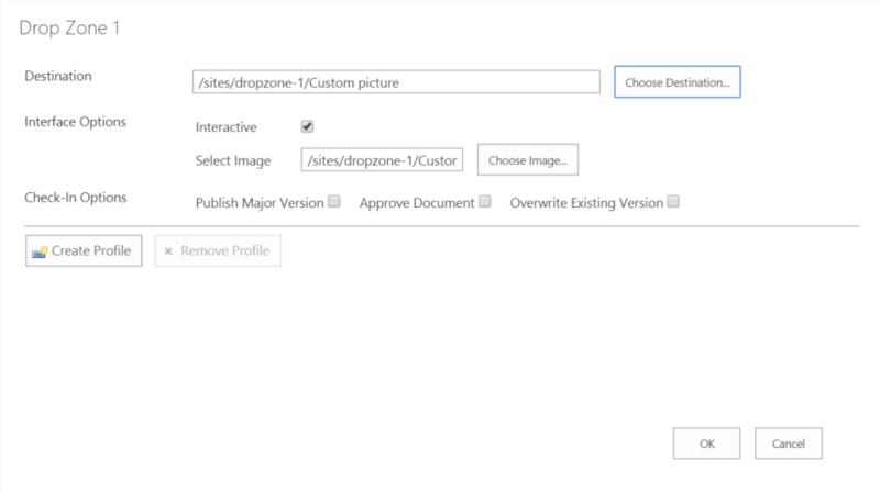
Click the Settings icon for the Drop Zone web part. The Drop Zone Settings page displays.
4. Perform the following actions in the Drop Zone Settings dialog:
-
Select Image – Populates automatically with the default Drop Zone image you selected, or you can choose an alternate image by clicking Choose Image.
5. Click OK to save the default image.
Setting the Local Default Drop Zone Image from Installed Location(s)
If you do not have access to the Governance Hub, you must configure the default Drop Zone image from the Gimmal Software Configuration page. The Gimmal Software Configuration page is a local Dashboard that lists all of the products installed on a local site.Local settings apply only to the current site. If you want to apply settings to multiple sites, apply the settings globally by performing the steps in the next section.
-
Navigate to the site where Drop Zone is deployed.
-
Select Settings > Site Settings. The Site Settings page displays.
-
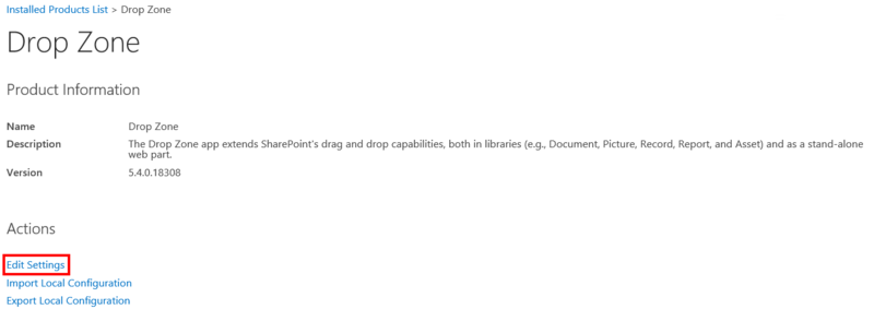
Under the Site Administration section, click Gimmal Software Configuration. The Installed Products List page displays, showing a Drop Zone tile.
-
Click the Drop Zone tile. The Drop Zone local configuration page displays.
-
Click Edit Settings. The Drop Zone Edit Settings Page displays.
6. Enter the URL of your default Drop Zone image on the Edit Local Settings page.
7. Click Save to save your settings.
Setting the Global Default Drop Zone Image from the Governance Hub
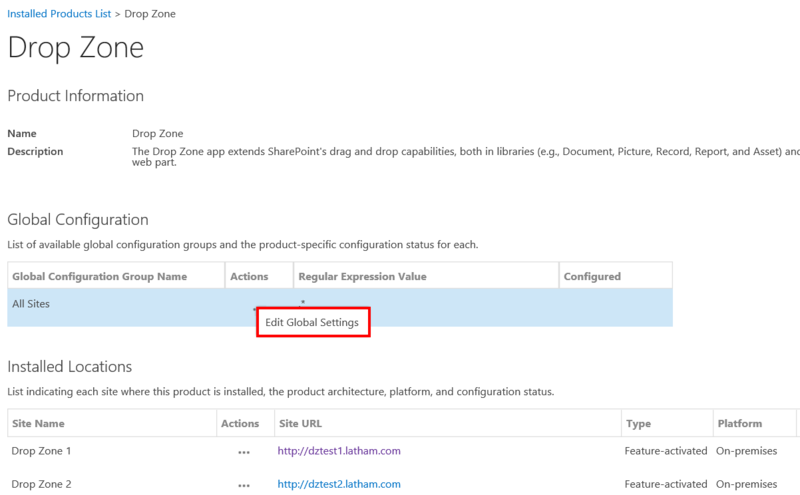
The Drop Zone global settings page, located in the Governance Hub, enables you to set the default image to display on all Drop Zone web parts. You can apply the default image globally, or you can set the default image for each site where this product is installed.
-
On the site where Governance Hub is deployed, navigate to Settings > Site Settings. The Site Settings page displays.
-
Under Site Administration, click Governance Hub. The Governance Hub Dashboard displays.
-
Click the Drop Zone tile. The Drop Zone Configuration page displays.
-
In the Global Configuration section, click the Open menu (…) next to the Global Configuration Group you want to edit, and then select Edit Global Settings.
For more information on Global Configuration Groups, see the Governance Hub Help section.
5. On the Drop Zone Global Settings page, enter the URL of your default Drop Zone image.
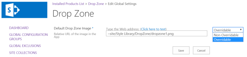
6. Select whether the default image will be Overridable or Non-Overridable. For more information on this option, see the previous notes on image order of priority.
If the image is set to Non-Overridable, then the default image cannot be changed on a local site. You can still change the default image for each individual Drop Zone web part.
7. Click Save to save your settings.
Adding Images to Drop Zone Library
The Drop Zone image library provides a repository for all images that are available for use with a Drop Zone web part. The image library comes pre-configured with two 800 pixels x 800 pixels .png image files, which you can use in the Drop Zone web part(s). Drop Zone accepts standard image file formats (e.g., .jpg, .png, .gif, .bmp).If you want to use a different default image for each Drop Zone web part(s), you can add additional images to the image library and apply them separately for each web part.
The optimal size for your Drop Zone images is 800 pixels x 800 pixels. If you use an image with different dimensions, it will be rescaled to fit within the Drop Zone web part.The default location for the Drop Zone image library is in the Style Library/Drop Zone folder. Each Drop Zone site will have its own Drop Zone image library folder.
-
Navigate to your Drop Zone site, and click Settings > Site Contents. The Site Contents page displays.
-
Click the Style Library tile. The Style Library displays.
-
Click the Drop Zone folder. The Drop Zone image library displays.
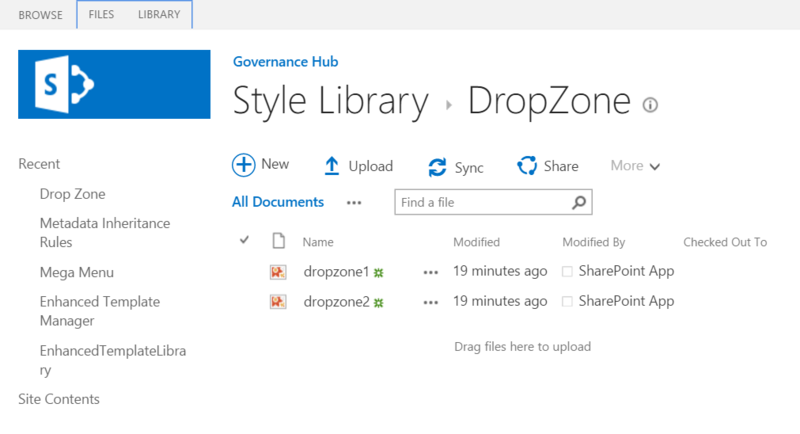
4. In the Drop Zone image library, click + new document. The Add a document dialog displays.
5. Choose your image file, the destination folder, and add any comments if desired.
6. Click OK. The image displays in the image library.
Adding & Configuring a Drop Zone Web Part
Drop Zone can be added and configured to function on any SharePoint page. This process enables you to add a Drop Zone web part to a page. Once saved, a tile appears on the page, providing an active Drop Zone for documents. This section provides steps on how configure and execute the Drop Zone web part.
The optimal size for your Drop Zone images is 800 pixels x 800 pixels. If you use an image with different dimensions, it will be rescaled to fit within the Drop Zone web part.The default location for the Drop Zone image library is in the Style Library/Drop Zone folder. Each Drop Zone site will have its own Drop Zone image library folder.
-
Navigate to the page you wish to add the Drop Zone web part to.
-
On the Page tab in the ribbon bar, click Edit to edit the page.
-
Click the Insert tab, then click Web Part in the ribbon bar.
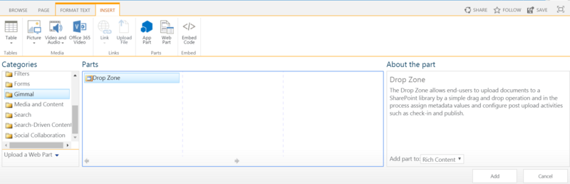
4. In the Categories list, select Gimmal.
5. In the Parts list, select Drop Zone.
6. Click Add on the right side of the screen. The web part is added to the page.
7. Click the Settings icon for the Drop Zone web part. The Drop Zone Settings page displays.
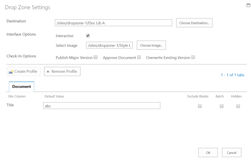
8. Click Choose Destination and select a destination library or folder. This is the folder that documents will be added to when you drag and drop content onto the Drop Zone.
9. Perform the following actions in the Drop Zone Settings dialog fields:
-
Interactive – Select the checkbox to enable a prompt for the user after documents are dropped onto the Drop Zone web part or library. This prompt enables the user to review and confirm the dropped files' properties before uploading the files to the library.
-
Select Image – Populates automatically with the default Drop Zone image you selected, or you can click Choose Image to choose an alternate image.
-
Publish Major Version – Select this checkbox to indicate whether to publish a major version of the dropped files. This flag has no effect if versioning is not enabled on the target library. Although the system ignores this flag if the underlying library is not configured for versioning, it could be useful to set it to true. That way, if you enable versioning on the underlying library, you do not have to modify the configuration settings.
-
Approve Document – Select this checkbox to indicate whether an approve action, made on behalf of the user who drops the files, should be attempted. If the user does not have permission to approve, the files are uploaded, but the approval fails with an error message. This flag has no effect if content approval is not required on the target library. Although the system ignores this flag if you do not configure the underlying library for content approval, it could be useful to set it to true. That way, if you enable content approval on the underlying library, you do not have to modify the configuration settings.
-
Overwrite Existing Version – Select this checkbox if you want to overwrite existing versions upon check-in.
10. Create a Content Type Profile. See Configuring a Content Type Profile (link) for steps on how to configure a Content Type Profile, then continue with step 11.
11. Click OK to save your settings.
Configuring Library-Based Drop Zone
-
Navigate to the SharePoint Library.
-
Click the Library tab.
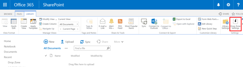
3. Click Drop Zone Settings on the ribbon bar. (This button appears on the Library ribbon bar when you added the app to the host site.) The Drop Zone Settings page displays.
4. Perform the following actions in the Drop Zone Settings page fields:
The Library-based Drop Zone Settings page does not include a Choose Destination option like the Drop Zone web part Settings page does. This is because documents will already be dropped into the library/folder.
-
Interactive – Select the checkbox to enable a prompt for the user after documents are dropped onto the Drop Zone web part or library. This prompt enables the user to review and confirm the dropped files' properties before uploading the files to the library.
-
Publish Major Version – Select this checkbox to indicate whether to publish a major version of the dropped files. This flag has no effect if versioning is not enabled on the target library. Although the system ignores this flag if the underlying library is not configured for versioning, it could be useful to set it to true. That way, if you enable versioning on the underlying library, you do not have to modify the configuration settings.
-
Approve Document – Select this checkbox to indicate whether an approve action, made on behalf of the user who drops the files, should be attempted. If the user does not have permission to approve, the files are uploaded, but the approval fails with an error message. This flag has no effect if content approval is not required on the target library. Although the system ignores this flag if you do not configure the underlying library for content approval, it could be useful to set it to true. That way, if you enable content approval on the underlying library, you do not have to modify the configuration settings.
5. Create a Content Type Profile. (See the next section for steps on how to configure a Content Type Profile.)
6. Click OK to save your settings.
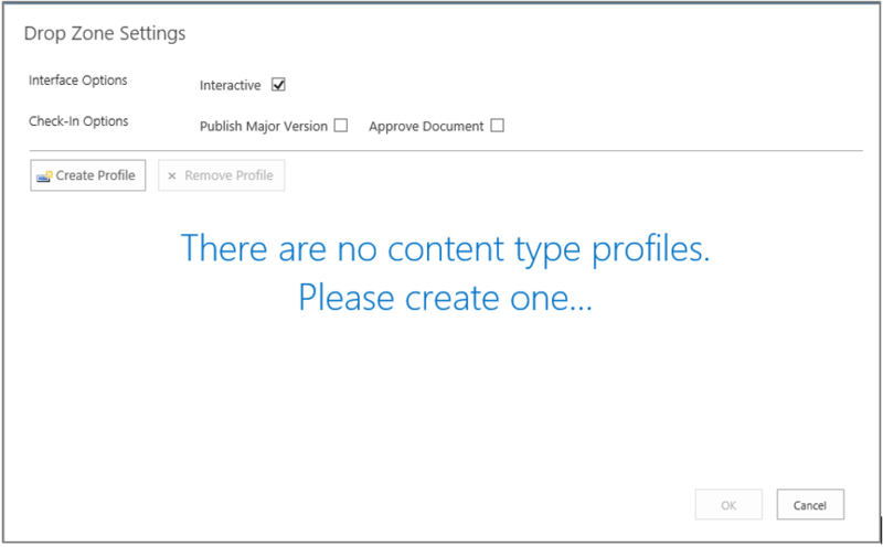
Configuring Content Type Profile
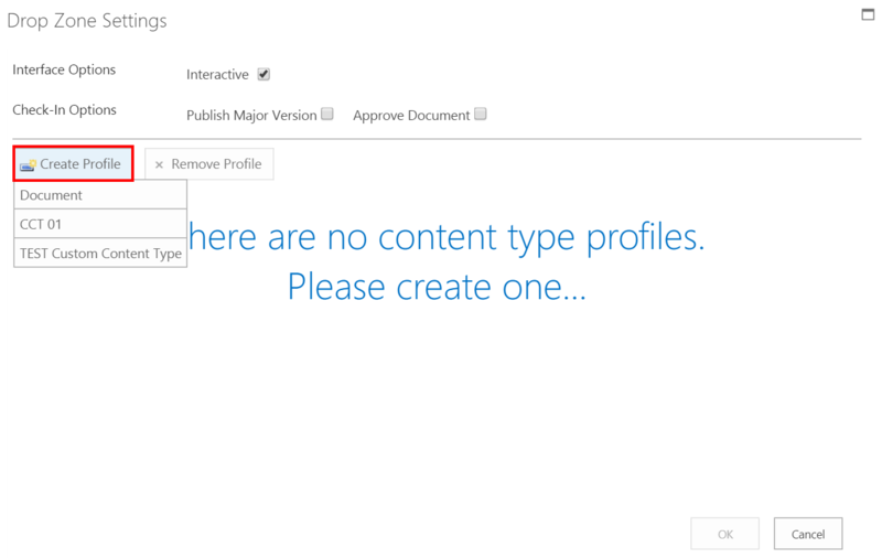
You must configure each Drop Zone with at least one content type profile. Content type profiles are specific to the selected content type, and a tab named for the content type will be created for each profile. The fields, to be configured with a default value, display on each tab. You can create multiple content type profiles for each of the content types associated to the target destination, or to the library if configuring the library-based Drop Zone.
-
Click Create Profile on the Drop Zone Settings page. Available content types for your library will display below the Create Profile button.
-
Select the desired content type. The available site columns associated with the content type will display on the page.
The Library-based Drop Zone Settings page does not include a Choose Destination option like the Drop Zone web part Settings page does. This is because documents will already be dropped into the library/folder.
3. On the Content Type Profile page, type or select the default information for fields (for example, Title, Description, etc.) that appear on each tab for this profile.
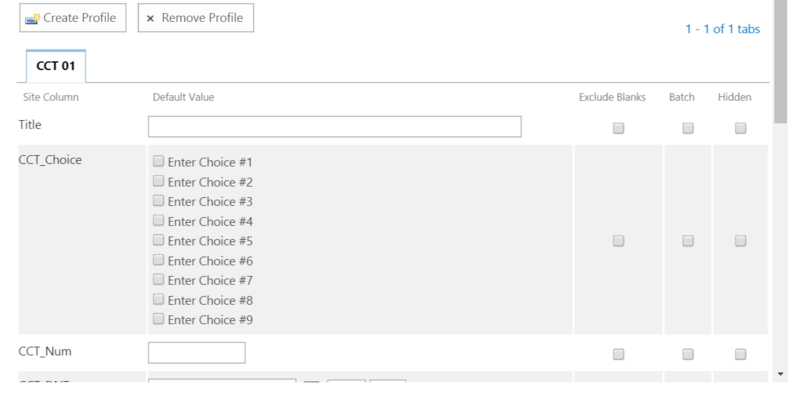
4. If desired, select the Exclude Blanks, Batch, or Hidden options, as described below:
-
Exclude Blanks - If you check the Exclude Blanks option, any blank value for that field will not overwrite data being set from another sources on import (e.g. a field value set by Gimmal's Metadata Inheritance Rules product or by a Column default value setting from SharePoint's Library settings). If you leave Exclude Blanks unchecked, then a blank data value for a Drop Zone field will overwrite data being set from another source on import (you will get a blank value).
If you upload a Microsoft Office document to SharePoint, SharePoint uses a document parser to retrieve any Office document properties (e.g. title, author name, date), and apply them to the documents that have been uploaded to SharePoint. If you check the Exclude Blanks option for the "Title" Site Column of a content type, the SharePoint document parser will override the Exclude Blanks option, and it will apply the original Office document Title property, including a blank value. A workaround is available for SharePoint 2013 on-premises only. See the following information from Microsoft. This workaround does not apply to an O365 environment.
-
Batch – Select to indicate that the default value for this field is applied to all documents dropped onto the Drop Zone in a given drop event. You can also select Batch and leave the field empty, indicating that if multiple files are dropped, you can set a value for all of them at once. When selected, this field displays on a Global tab for the dropped document set. If not selected, this field displays on each per-document tab for the dropped document set. This field enables you to set metadata on multiple files that are being dropped only once, as opposed to clicking on each separate tab and setting the same value.
-
Hidden – Select to indicate whether to show or hide this field during the review and confirm step of the upload process. The default value is still applied to the document even though it is hidden during the upload process. If you do not select the Interactive checkbox for the Drop Zone configuration, the Hidden flag is irrelevant since the user is not prompted for metadata values during upload when the Drop Zone is not Interactive.
5. Click OK. Save changes to the page if editing a web part.
Configuring Inline Drop Zone
Drop Zone ships with a Drop Zone web part that is deployed to the web part gallery and can easily be added to a page. However, there is a second approach to creating Drop Zones that allows for additional flexibility in how you use the product. The Inline Drop Zone approach is based on a Drop Zone script that searches for specific elements on the page and processes them just like regular Drop Zones.
-
Adding the 'carbon-dropzone' CSS class to the element.
-
Ensuring that the element has an ID (can be any ID you specify, but if you add multiple IDs, they must each have a unique name within a site collection).
Creating a More Visible Drop Zone
The default Drop Zone images are limited in size to 800 pixels x 800 pixels. You can use an image with different dimensions, but it will be rescaled to fit within this Drop Zone web part. You have the option, though, to create Drop Zones using an image with different dimensions so that your Drop Zone displays more like a feature or banner, for example. To add a larger Drop Zone Image to a SharePoint page, follow these steps on the page you want to add the Inline Drop Zone to. You must have "Edit" permissions to edit the page.
-
Click Page on the ribbon, and then Edit.
-
Click Insert, and then Web Part. A list of web part categories and parts displays.
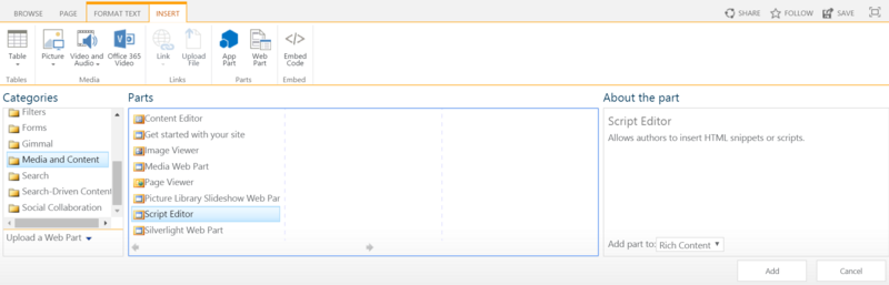
3. In the Categories list, select Media and Content.
4. In the Parts list, select Script Editor.
5. Click the Add button on the right side of the page. The Script Editor web part is added to the page.
6. Click the drop-down arrow on the right side of the Script Editor web part, and select Edit Web Part.
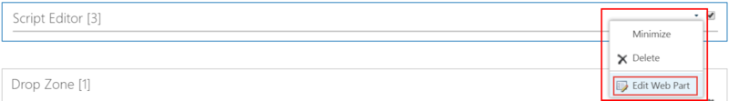
7. On the next screen, select Edit Snippet.
8. In the Embed dialog that displays, enter the following HTML below, using your own ID and image URL (highlighted), and then click Insert:
<div class="carbon-dropzone" id="dz1"> <img src="http://www.businesscomputingworld.co.uk/wp-content/uploads/2012/09/Invoice-Processing.jpg" /></div>
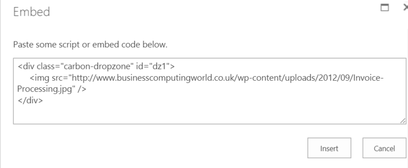
Ensure that the CSS code meets the following requirements:
-
<div class> is set to 'carbon-dropzone'
-
There is a unique IS (e.g., 'dz100')
-
<img src> points to a valid image file (e.g., jpg or png)
9. Return to the page ribbon and click Page > Save.
10. After saving, click the Settings icon in the top right corner to configure the Drop Zone.
Creating Multiple Drop Zones on a Page
To improve Drop Zone functionality, you can use the Inline feature to create multiple, separately-configured Drop Zones on a page. For example, you can arrange the Drop Zones in a "tile" format to resemble the Windows Start screen.
-
Perform steps 1 – 7 in the previous section.
-
In the Embed dialog that displays, enter the following HTML shown below, using your own IDs and image URLs (bolded), and then click Insert:
<table> <tr> <td rowspan="2"> <div class="carbon-dropzone" id="dz1"> <img src="http://www.businesscomputingworld.co.uk/wp-content/uploads/2012/09/Invoice-Processing.jpg" style="width:400px; height: 200px"/> </div> </td> <td> <div class="carbon-dropzone" id="dz2"> <img src="http://www.medpointmedical.com/images/procedures.png" style="width:300px; height:100px"/> </div> </td> </tr> <tr> <td> <div class="carbon-dropzone" id="dz3"> <img src="http://www.d-toolsblog.com/wp-content/uploads/2011/11/custom_reports_image.jpg" style="width:300px; height:100px"/> </div> </td> </tr></table>
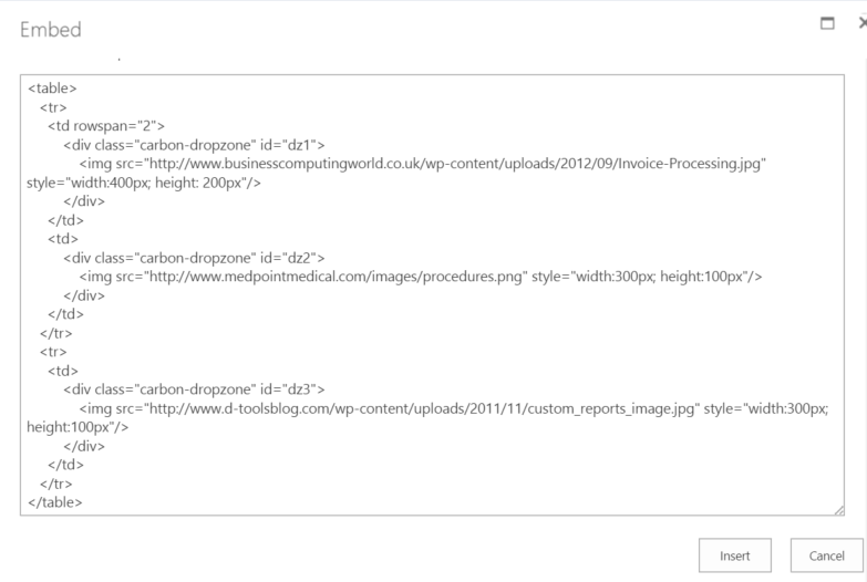
You may need to adjust the formatting of the tables in which you inserted the CSS code.
3. Return to the page ribbon and click Page > Save.
4. After saving, click the Settings icon in the top right corner to configure the Drop Zone as desired.